This article was co-authored by wikiHow staff writer, Travis Boylls. Travis Boylls is a Technology Writer and Editor for wikiHow. Travis has experience writing technology-related articles, providing software customer service, and in graphic design. He specializes in Windows, macOS, Android, iOS, and Linux platforms. He studied graphic design at Pikes Peak Community College.
wikiHow marks an article as reader-approved once it receives enough positive feedback. In this case, 99% of readers who voted found the article helpful, earning it our reader-approved status.
This article has been viewed 983,890 times.
Learn more...
It can be very helpful to put multiple data trends onto one graph in Excel. But, if your data has different units, you may feel like you can't create the graph you need. But have no fear, you can -- and it is actually pretty easy! This wikiHow teaches you how to add a second Y Axis to a graph in Microsoft Excel.
Things You Should Know
- Microsoft Excel gives you the option to add a secondary axis to your graphs.
- To add a secondary axis, you'll need to edit the Series Options.
- To change the chart type of the secondary axis, you can right-click the graph and select the option.
Steps
Adding a Second Y Axis
-
1Create a spreadsheet with your data. Each data point should be contained in an individual cell with rows and columns that are labeled.
-
2Select the data you want to graph. Click and drag to highlight all the data you want to graph. Be sure to include all data points and the labels.
- If you don't want to graph the entire spreadsheet, you can select multiple cells by holding Ctrl and clicking the cells you want to graph.
Advertisement -
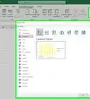
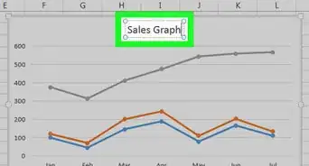
3Click Insert. It's in the menu bar at the top of the page. This displays the Insert panel at the top.
-
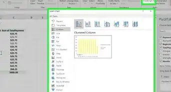
4Click the icon that resembles a chart type you want to create. This generates a chart based on the selected data.
- You can also add a second axis to a line graph or a bar graph.
-
5Double-click the line you want to graph on a second axis. Clicking the line once highlights each individual data point on the line. Double-clicking it displays the "Format Data Point" menu to the right.[1]
-
6Click the icon that resembles a bar chart. This is the "Series Options" icon. It's at the top of the Format Data Point menu to the right.
-
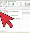
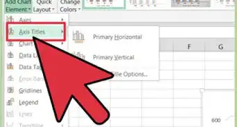
7Select the radio button for "Secondary Axis". It's below "Series Options" in the Format Data Point menu. This immediately displays the line on a secondary axis with the numbers on the right side.


Changing the Chart Type of the Secondary Axis
-
1Right-click the chart. The chart is in the middle of the Excel spreadsheet. This displays a menu next to the line in the chart.
-
2Click Change Series Chart Type. This displays a window that allows you to edit the chart.
-
3Click the checkbox next to any other lines you want to add to the Y-axis. To add other lines to the Y-axis, click the checkbox below "Y-axis" to the right of the data series in the lower-right corner of the window.
-
4Select the type of chart for each data series. In addition to graphing a data series on a separate Y-axis, you can also graph it on a different chart type. Use the drop-down menu to select the chart type for each data series in the lower-right corner of the window.
-
5Click Ok. This saves the changes you made to the chart.
- If you want to change the chart type for the entire chart, click the chart type in the menu to the left of the window and then double-click the chart style in the window.


Community Q&A
-
QuestionI have the vertical columns for the first set of data, but how do I add the horizontal axis for the next set of data?
 Community AnswerRight Click in the Chart area. Click the Add Button under the "Legend Entries (Series)" and enter correct cells that have the data you want graphed. Click Edit under "Horizontal (Category) Axis Label" and click okay.


References
About This Article

1. Create a spreadsheet with the data you want to graph.
2. Select all the cells and labels you want to graph.
3. Click Insert.
4. Click the line graph and bar graph icon.
5. Double-click the line you want to graph on a secondary axis.
6, Click the icon that resembles a bar chart in the menu to the right.
7. Click the radio button next to "Secondary axixs.