X
This article was co-authored by wikiHow staff writer, Jack Lloyd. Jack Lloyd is a Technology Writer and Editor for wikiHow. He has over two years of experience writing and editing technology-related articles. He is technology enthusiast and an English teacher.
The wikiHow Tech Team also followed the article's instructions and verified that they work.
This article has been viewed 1,491,025 times.
Learn more...
This wikiHow teaches you how to create a line graph from Microsoft Excel data. You can do this on both Windows and Mac versions of Excel.
Steps
Part 1
Part 1 of 2:
Creating a Graph
-
1Open Microsoft Excel. Double-click the Excel program icon, which resembles a white "X" on a green folder. Excel will open to its home page.
- If you already have an Excel spreadsheet with data input, instead double-click the spreadsheet and skip the next two steps.
-
2Click Blank Workbook. It's on the Excel home page. Doing so will open a new spreadsheet for your data.
- On a Mac, Excel may just open to a blank workbook automatically depending on your settings. If so, skip this step.
Advertisement -
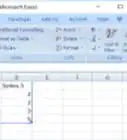
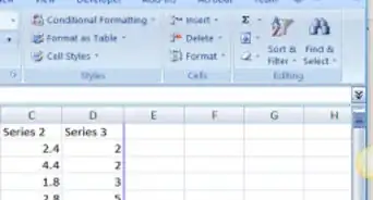
3Enter your data. A line graph requires two axes in order to function. Enter your data into two columns. For ease of use, set your X-axis data (time) in the left column and your recorded observations in the right column.
- For example, tracking your budget over the year would have the date in the left column and an expense in the right.
-
4Select your data. Click and drag your mouse from the top-left cell in the data group to the bottom-right cell in the data group. This will highlight all of your data.
- Make sure you include column headers if you have them.
-
5Click the Insert tab. It's on the left side of the green ribbon that's at the top of the Excel window. This will open the Insert toolbar below the green ribbon.
-
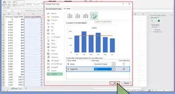
6Click the "Line Graph" icon. It's the box with several lines drawn on it in the Charts group of options. A drop-down menu will appear.
-
7Select a graph style. Hover your mouse cursor over a line graph template in the drop-down menu to see what it will look like with your data. You should see a graph window pop up in the middle of your Excel window.
-
8Click a graph style. Once you decide on a template, clicking it will create your line graph in the middle of the Excel window.


Advertisement
Part 2
Part 2 of 2:
Customizing the Graph
-
1Customize your graph's design. Once you create your graph, the Design toolbar will open. You can change your graph's design and appearance by clicking one of the variations in the "Chart Styles" section of the toolbar.
- If this toolbar doesn't open, click your graph and then click the Design tab in the green ribbon.
-
2Move your line graph. Click and drag the white space near the top of the line graph to move it.
- You can also move specific sections of the line graph (e.g., the title) by clicking and dragging them around within the line graph's window.
-
3Resize the graph. Click and drag one of the circles on one of the edges or corners of the graph window in or out to shrink or enlarge your graph.
-
4Change the graph's title. Double-click the title of the graph, then select the "Chart Title" text and type in your graph's name. Clicking anywhere off of the graph's name box will save the text.
- You can do this for your graph's axes' labels as well.


Advertisement
Community Q&A
-
QuestionHow do I name the y and X axis in the graph?
 Community Answer1. Click on the graph. 2. Select 'Chart Elements' on the side, which is the plus icon. 3. Tick the 'Axis Titles' box. Some text boxes should appear on the x and y axis.
 -
QuestionIf multiple lines are present in my chart, how can I view one at a time?
 Community AnswerOne method is to hide the relevant rows or columns that you do not wish to show on the graph. Hidden rows and columns are not displayed.
 -
QuestionWhy do my years show up as numbers?
 Community AnswerBecause A,B,C,D,E, and F, mean this: (A:2000->B:2001->C:2002->D:2003->E:2004->F:2005.)
Advertisement
Warnings
- Some graphs are geared toward specific sets of data (e.g., percentages or money). Make sure your selected template doesn't have a theme before creating your graph.⧼thumbs_response⧽
Advertisement


About This Article
Jack Lloyd
wikiHow Technology Writer
This article was co-authored by wikiHow staff writer, Jack Lloyd. Jack Lloyd is a Technology Writer and Editor for wikiHow. He has over two years of experience writing and editing technology-related articles. He is technology enthusiast and an English teacher. This article has been viewed 1,491,025 times.
How helpful is this?
Co-authors: 23
Updated: February 6, 2023
Views: 1,491,025
Categories: Microsoft Excel | Graphs
Article SummaryX
1. Open a new Excel document.
2. Enter your graph's data.
3. Select the data.
4. Click the green Insert tab.
5. Click the "Line Graph" icon.
6. Click a line graph template.
Did this summary help you?
Advertisement