This article was co-authored by Jear Keokham and by wikiHow staff writer, Jack Lloyd. Jear Keokham is a Marketing Professional and the Director of Operations and Creative Strategy at Aerial Canvas, a full-service agency providing real estate marketing solutions in California. With 6 years of experience and education, he specializes in marketing strategy, content production, creative processes, and organizational systems. Jear holds a BA in Art with a Minor in History of Art from The University of California, Berkeley. His dedication to high-quality photography, cinematography, and aerial drone services has allowed for Aerial Canvas’ work to be featured on various platforms including Compass, Sotheby's, Coldwell Banker Realty, and Vanguard.
wikiHow marks an article as reader-approved once it receives enough positive feedback. In this case, 91% of readers who voted found the article helpful, earning it our reader-approved status.
This article has been viewed 1,338,544 times.
This wikiHow teaches you how to design a website which appears professional and performs well. While the bulk of your website's design is ultimately up to you, there are some critical things to do—and avoid—when creating a website.
Steps
Designing Your Website
-
1Determine whether you want to use a website creator. Websites created from scratch require a fairly detailed understanding of HTML coding, but you can easily create a website by using a free hosting service like Weebly, Wix, WordPress, or Google Sites. Website creators tend to be much easier for first-time designers to use than HTML.
- If you do decide to code your own website, you'll need to learn both HTML and CSS coding.
- If investing the time and energy to create your website doesn't sound appealing, you can also hire a website designer to create your site for you. Freelance designers can cost anywhere between $30 an hour and well over $100 per hour.
-
2Map out your site. Before you even open a website creator, you should know approximately how many pages you want your website to have, what the content on each of those pages should be, and the general layout of important pages such as the home page and the "About" page.[1]
- Your website's pages may be easier to visualize if you draw rough pictures of each of them rather than just determining what content should appear.
Advertisement -
3Use intuitive design. While there's something to be said for fresh ideas, your website's basic design should follow established guidelines such as the following:[2]
- Navigation options (e.g., tabs for different pages) should go at the top of the page.
- If you use a menu icon (☰), it should be in the top-left corner of the page.
- If you use a search bar, it should be near the upper-right side of the page.
- Helpful links (e.g., links to the "About" page or the "Contact Us" page) should go at the very bottom of each page.
-
4Be consistent. Whatever text font, color palette, image theme, and design options you choose, make sure that you use the same decision throughout your website. It can be incredibly jarring to see one font or color scheme used for the "About" page when a completely different one was used for the home page.[3]
- For example, if you exclusively use cool-tone colors for your site's home page, don't implement bright, loud colors on the next page.
- Keep in mind that using loud or clashing colors, especially when the colors display in a dynamic (e.g., moving) fashion, can evoke epilepsy in a small number of web users. If you decide to use such colors on your site, make sure you add an epilepsy warning before any relevant pages.
-
5Add navigation options. Placing direct links to important pages on your website at the top of the home page will help direct first-time visitors to the content that matters. Most site creators add these links by default.
- It's important to make sure that every page on your website is accessible by clicking through options on your website rather than only being accessible via the page's address.
-
6Use colors which complement each other. Like any other kind of design, website design relies on visually pleasing combinations of color; because of this, picking theme colors which go together is crucial.
- Black, white, and grey is a good combination if you don't know where to start.
-
7Consider using a minimalist design. Minimalism encourages cool-tone colors, simple graphics, black-on-white text pages, and as little embellishment as possible. Because minimalism requires little in the way of fancy elements, it's an easy way to make your website look professional and attractive without requiring much work.
- Many website creators will have a "minimalist" theme you can select when setting up your website.
- An alternative to minimalism is "brutalism", which uses harsher lines, bright colors, bold text, and minimal imagery. Brutalism has less of a following than does minimalism, but depending on your website's content, it may better suit your design needs.
-
8Make unique choices. Straight lines and grid-locked web elements are safe bets, but making a few unique stylistic decisions will both lend personality to your site and help your site stand out.[4]
- Don't be afraid to buck trends by placing website elements asymmetrically or using overlapping elements to create a layered appearance.
- While elegant, sharp corners and squared-off elements (also known as a "card-based" presentation) are less favorable than are rounded, soft elements.
Maximizing Performance
-
1Take advantage of mobile optimization options. Mobile browsers account for more web traffic than do desktop browsers, meaning that the amount of attention you pay to your website's mobile version should at least equal your desktop website's development. Most website creator services automatically create a mobile version of your site, but you'll want to keep the following information in mind for your mobile site:[5]
- Ensure that buttons (e.g., site links) are large and easy to tap.
- Avoid implementing features which can't be viewed on mobile (e.g., Flash, Java, etc.).
- Consider having a mobile app made for your website.
-
2Avoid using too many photos per page. Both desktop and mobile browsers can struggle to load pages which display a large number of photos or videos. While images are important in web design, using more than a few per page can cause unnecessarily long load times, which will prevent people from visiting the page(s) in question.
- Generally speaking, you want your website's pages to load in under four seconds.
-
3Add a "Contact" page. You'll notice that virtually all established websites have a "Contact Us" page which has contact information (e.g., a phone number and an email address); some sites even have a built-in question form on this page. Adding a "Contact' page will give website viewers a direct line of communication to you, thus adding a solution to potential frustrations.
-
4Create a custom 404 page. When someone visits a specific page on your website which either hasn't been set up or doesn't exist, a "404 Error" web page will display. Most browsers have a default 404 page, but you may be able to customize yours from within your website creator's settings; if so, make sure that you include the following details:
- A light-hearted error message (e.g., "Congratulations - you've found our error page!")
- A link back to the site's home page
- A list of commonly viewed links
- An image or logo for your website
-
5Use a search bar if possible. If your website creation method supports adding a search bar to your website, it's strongly recommended that you do so. This will ensure that users can quickly navigate to a specific page or item without having to click through your navigation options.[6]
- Search bars are also useful when your audience wants to search for a general term without using trial-and-error.
-
6Invest the most amount of time in your home page. When someone arrives on your website's home page, they should get the gist of your website's theme immediately; in addition to this, all elements of the home page should load quickly, including navigation options and any images. Your home page should have the following aspects:[7]
- A call to action (e.g., a button to click or a form to fill out)
- A navigation toolbar or menu
- An inviting graphic (e.g., one solid photo, a video, or a small group of photos with accompanying text)
- Keywords pertaining to your website's service, topic, or focus
-
7Test your website in multiple browsers on multiple platforms. This is incredibly important, as different browsers may handle aspects of your website differently. Before you begin promoting your website, try visiting and using your website in the following browsers on Windows, Mac, iPhone, and Android platforms:
- Google Chrome
- Firefox
- Safari (iPhone and Mac only)
- Microsoft Edge and Internet Explorer (Windows only)
- The built-in browser on several different Android phones (e.g., Samsung Galaxy, Google Nexus, etc.)
-
8Continue updating your website as it ages. Design trends, links, photos, concepts, and keywords all change as time goes by, so you'll have to continue making changes to your website in order to stay up to date. This will require you to check your website's performance alongside other similar websites at least once every three months (preferably more often).[8]
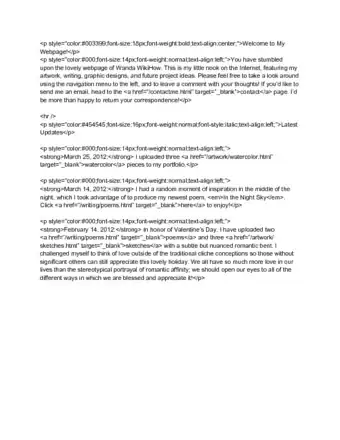
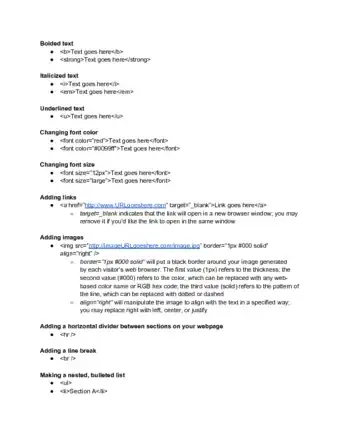
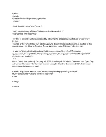
Basic HTML Help
Expert Q&A
-
QuestionIs it better to build a website from scratch or use a template?
 Ryan ConwayRyan Conway is a Marketing Expert and the Founder of Digital Tradesman, a digital marketing agency that helps builders, contractors, and tradesmen grow their business online. With over a decade of experience, he specializes in marketing, web design, and search engine optimization. Ryan holds a BS in Business Administration and Entrepreneurial Studies from Hartford University. He also studied Graphic and Web Design at the Boston University Center for Digital Imaging Arts. Ryan participated in Seth Godin’s altMBA in the winter of 2016.
Marketing Expert It's better to start from scratch—this way, you can think about what kind of content your website will need first. Once you've settled on a content plan, you can start designing.
 -
QuestionWhat is the best layout for website design?
 Ryan ConwayRyan Conway is a Marketing Expert and the Founder of Digital Tradesman, a digital marketing agency that helps builders, contractors, and tradesmen grow their business online. With over a decade of experience, he specializes in marketing, web design, and search engine optimization. Ryan holds a BS in Business Administration and Entrepreneurial Studies from Hartford University. He also studied Graphic and Web Design at the Boston University Center for Digital Imaging Arts. Ryan participated in Seth Godin’s altMBA in the winter of 2016.
Marketing Expert It depends on your website's focus. Try thinking about your website architecturally: what are the main kinds of topics that you're going to have on your website, and how do you group them in a logical sense?
 -
QuestionWhat if I'm having trouble brainstorming designs?
 Jear KeokhamJear Keokham is a Marketing Professional and the Director of Operations and Creative Strategy at Aerial Canvas, a full-service agency providing real estate marketing solutions in California. With 6 years of experience and education, he specializes in marketing strategy, content production, creative processes, and organizational systems. Jear holds a BA in Art with a Minor in History of Art from The University of California, Berkeley. His dedication to high-quality photography, cinematography, and aerial drone services has allowed for Aerial Canvas’ work to be featured on various platforms including Compass, Sotheby's, Coldwell Banker Realty, and Vanguard.
Marketing Expert It can help to look at other websites you find yourself coming back to regularly. Study the way their pages are arranged and try to identify what makes the design so intuitive and attractive.
Warnings
- Most site creators are free; however, if you want to use your own domain (e.g., "www.yourname.com" instead of "www.yourname.wordpress.com"), you'll have to pay a monthly or an annual fee.⧼thumbs_response⧽
- Avoid plagiarism and observe all copyright laws: don’t add random images from the web, or even structural elements, without permission.⧼thumbs_response⧽
References
- ↑ Ryan Conway. Marketing Expert. Expert Interview. 17 March 2021.
- ↑ Sarah Harkleroad. Marketing & Branding Expert. Expert Interview. 30 March 2021
- ↑ Jear Keokham. Marketing Expert. Expert Interview. 11 May 2021.
- ↑ https://webflow.com/blog/19-web-design-trends-for-2018
- ↑ https://99designs.com/blog/trends/web-design-trends-2018/#mobile-first
- ↑ Ryan Conway. Marketing Expert. Expert Interview. 17 March 2021.
- ↑ https://www.godaddy.com/garage/design-website-youre-not-website-designer/
- ↑ Sarah Harkleroad. Marketing & Branding Expert. Expert Interview. 30 March 2021
About This Article
1. Map out your site on paper.
2. Plan how people will navigate through the pages.
3. Choose a consistent color scheme.
4. Choose a website creator or learn to code by hand.
5. Consider hiring a freelance designer.
6. Find a reliable webhost.
7. Use keywords to promote your site in search results.
8. Test your website on many browsers and platforms.


