This article was co-authored by wikiHow staff writer, Maddie Holleman. Maddie Holleman is a Technology Writing Intern for wikiHow. Alongside writing many articles on technology and social media, Maddie has previously worked as a social media strategist and publicist for two organizations and has been using social media for years. She is currently pursuing a degree in Anthropology and Digital Studies at Davidson College.
This article has been viewed 16,205 times.
Learn more...
It's easy to graph multiple lines using Excel! If your spreadsheet tracks multiple categories of data over time, you can visualize all the data at once by graphing multiple lines on the same chart. You can either create a graph from scratch or add lines to an existing graph. This wikiHow article will teach you how to graph multiple lines.
Steps
Setting Up an Excel Spreadsheet
-
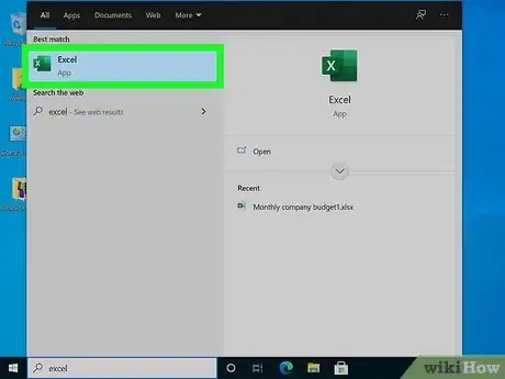
1Open Excel. Enter Excel by either opening the application downloaded to your device or on an internet browser through your Microsoft Office 365 account. If you do not have the Excel app or a Microsoft 365 subscription, you can buy it or start a free trial on the Microsoft website at https://www.microsoft.com/en-us/microsoft-365/excel.
- Excel is available on Windows, Mac, and Android devices. You can use Excel on a computer, tablet, or phone.
- A subscription to Microsoft 365 will give you access to Excel, Word, Powerpoint, and many other Microsoft applications. This subscription costs $69.99/year for an individual plan, and $99.99/year for the family plan. The family plan can be shared with up to 6 people.[1]
-
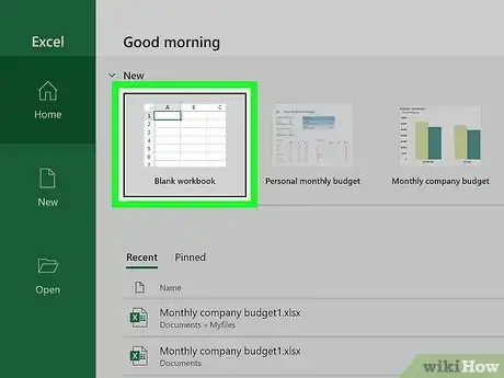
2Start a new workbook. On your Excel home screen, click "New blank workbook". This action will open an empty spreadsheet where you can begin to enter your data.
- If you have already started working on a spreadsheet which you would like to use for your graph, you can open that workbook from the Excel homepage under either the "All" or "My recent" categories.
- Directly next to the "New blank workbook" option, you will see "Welcome to Excel". If you are new to Excel, consider clicking this option to learn the basics of using this application.
Advertisement -
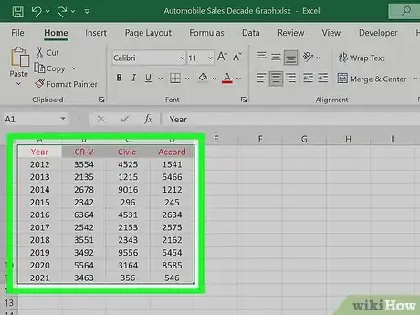
3Arrange your data in columns. Plotting a line requires data for two different axes. On a line graph, these axes measure change in data over time. For example, if you were measuring distance over time, the x-axis would be time and the y-axis would be distance. Let the leftmost column, column A, represent time, your x-axis. Enter the points in time you want your x-axis to cover in column A. In the next column over, enter the data points for the first line you wish to plot over the time period in column A. Add the data for your next line in the next column over, and repeat this process until all of the data points you want to graph are listed under a column on the spreadsheet. These columns will all appear as lines plotted over time, the x-axis of your graph.[2]
- All of the data points for the same line need to be listed in the same column.
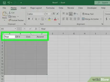
- Label your data categories in row 1. For column A, this label will be the metric of time you will graph your lines over. Label your other columns with the category of data they represent.
- For example, if you were graphing the sales of different Honda models over the past decade, column A would be labeled "Year" and columns B, C, and D could be labeled "CR-V", "Civic", "Accord", and so on. Your lines would then be labeled as CR-V, Civic, and Accord, and plotted over the years you entered in column A.
Use your Spreadsheet Data to Graph Multiple Lines
-
1Select the data you wish to graph. Click and drag your mouse over the columns of data you wish to graph. Drag your mouse from the top left corner to the bottom right corner of the data set you want to appear in your graph. The data you have selected will be highlighted in the spreadsheet.
- Each column of data you select will be plotted as a different line on your graph.
- Be sure to include the column headers in your selected data group. These categories will be shown on the legend of your line graph.
-
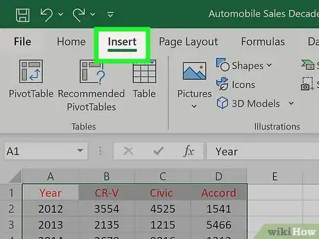
2Click "Insert" in the menu at the top of your screen. Above the spreadsheet, you will see a menu of editing options for your spreadsheet. Find and click on the "Insert" option in this menu.
-
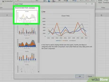
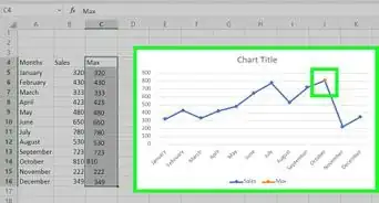
3Choose the line graph icon from "Recommended Charts". Below the menu where you selected "Insert", you should see a new menu which will include a section of "Recommended Charts". In this section, select the line graph icon to insert a line graph of your data into the spreadsheet.[3] Inserting a line graph will automatically generate a graph of lines representing your data points. Each of your data columns will appear as a separate line on the graph.
- If you wish to create a line graph with just one line, select only one column of data before inserting your graph.
- Graphing multiple lines on the same chart is a great way to visually compare data sets.
- If you labeled each of your data categories in row 1, these labels will appear in a legend at the bottom of your graph, showing which color line symbolizes which group of data.
Add a Line to an Existing Graph
-
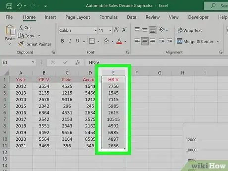
1Enter a new data column into your spreadsheet. Add your data into the column directly to the right of the last data column included in your graph.
- Be sure to title this column in row 1 so that it is labeled on the graph.
- You can create a new graph including this data by repeating the steps of highlighting a data set and inserting a line graph.[4] If you would rather add a new line to an existing graph, follow the steps below.
-
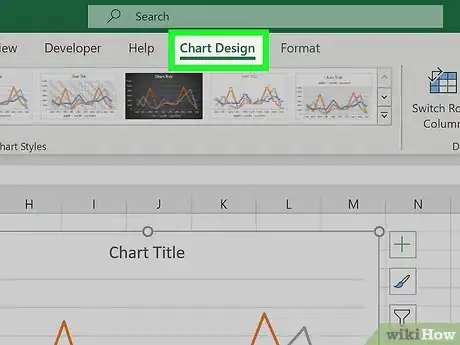
2Select the graph and click the "Chart" option at the top of your spreadsheet. Click once on the line graph in your spreadsheet to select it. Then navigate to the "Chart" section in the menu at the top right corner of your spreadsheet.
- In this menu, you can edit many components of your graph such as the title and style of your line graph.
-
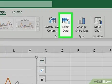
3Click the "Select Data" option in the drop-down menu. Opening the "Chart" section will drop down a menu of more specific options related to your graph. Choosing the "Select Data" option will pull up a window representing which range of data is represented by your line graph.
-
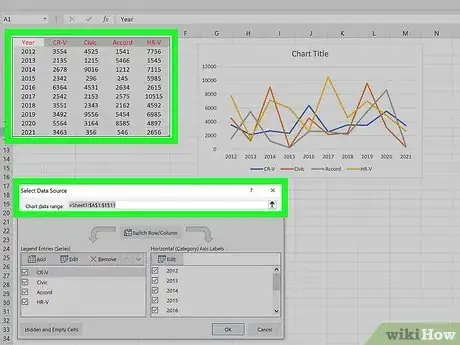
4Change the data range to include the new data column(s). In the "Select Data" window, you should see a data range. Say, for example, your data range covers from column A, row 1, to column E, row 6 on the spreadsheet. This data range would appear as "=Sheet1!$A$1:$E$6". Add new data to this range by changing the second letter value of the range to the letter of the furthest right column you are adding plotting on your graph. Updating a graph's range of data will automatically plot that data on the graph.
- If you had graphed lines for columns A through E, and wanted to make lines for data in columns F and G, you would change the second letter in the range to "G".
- If you are adding a new row of data, change the second number value to include the new number row you want to graph.
- Update your data range to include as many new columns of data as you want. Each column of data you add to the range will be plotted as a separate line.
