wikiHow is a “wiki,” similar to Wikipedia, which means that many of our articles are co-written by multiple authors. To create this article, 25 people, some anonymous, worked to edit and improve it over time.
This article has been viewed 368,044 times.
Learn more...
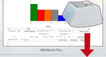
A bar graph, also known as a bar chart, is a graph that uses rectangular bars to represent different values to show comparisons among categories, such as the amount of rainfall that occurred during different months of a year, or the average salary in different states. Bar graphs are most commonly drawn vertically, though they can also be depicted horizontally. If you want to know how to make a bar graph of your own, see Step 1 to get started.
Steps
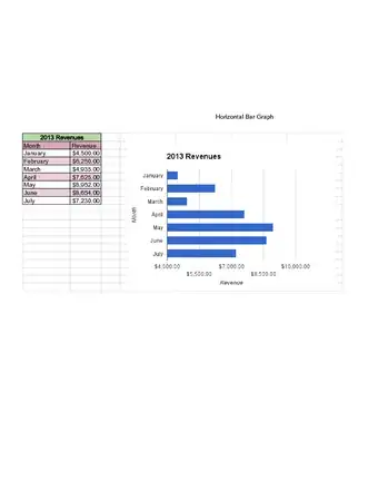
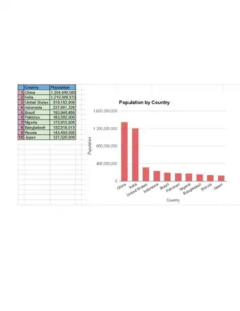
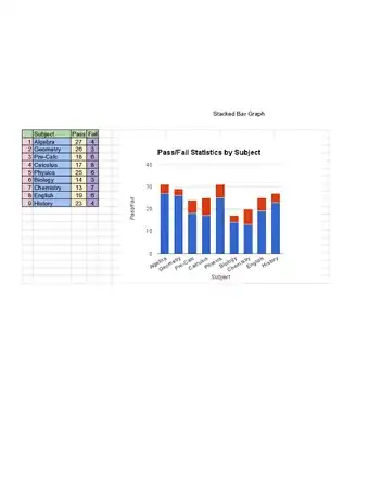
Sample Bar Graphs
Making Your Own Bar Graphs
-
1Collect your data. The first thing you have to do is to collect all of your data. Remember that a bar graph should show a comparison among categories. Let's say your goal is to organize data on how many inches of rainfall a city received between the months of February 2005 and February 2006. You'll need to find out exactly how much rain fell during each of the months. Once you have this data, you can begin to draw the graph.[1]
- Another use of rectangular bars on a graph is called a "histogram", not "bar graph", to display a continuous range of data in increasing or decreasing value in a list of equally divided range segments to show how these compare. For example, if you were to measure how many people in a classroom fell into a range of heights, and one range was 5 feet (1.5 m) to 5 feet 3 inches (7.6 cm), and so on, then you'd need to use a histogram.
-
2Draw an x and a y-axis. This will look like a large "L" shape. Bar charts are often drawn when one set of data is expressed as a set of categories (which can be periods of time), in which case this set will be the base. The other axis will be values (sales, costs, grades, scores, production amounts, other quantities, etc) for the base categories, groups or periods.[2]Advertisement
-
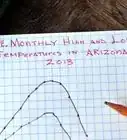
3Label the x-axis. Divide the number of squares (convenient units) across the page by the number of bars you need to draw to find the width of each bar. If this gives a fraction, round down to the nearest whole number. If the bars do not touch, choose a convenient space and leave this blank between the pairs of bars, often from an appropriate beginning point, such as January, or a certain year. In this example, you should label the x-axis with the names of each of the months you will be using. Let's say you're looking at the months between February of 2005 and February of 2006.[3]
- Label the bottom axis. After you've marked down all of the months that you'll be categorizing, you can give the entire axis a label. In this case, let's label the axis "Months".
-
4Label the y-axis. Divide the highest value of all the bars by the number of squares left above the bottom axis to find what each square represents. If this is a fraction, round up to the nearest whole number. Label the point where the axes meet as 0. Each square above 0 increases by the calculated amount until the value is equal to or greater than the largest vertical bar. If you're working with inches of rain, and your range of rainfall falls from between 10 inches (25.4 cm) and 70 inches (177.8 cm), then it will make sense to label the vertical axis in increments of ten, starting with 0, then 10, then 20, then 30, and so on.[4]
-
5Draw your bars. Extend the base you have marked on the bottom axis to the horizontal line labelled with the value of that bar. If the value falls between two lines, approximate where the correct value would lie. Notice that bars are normally separated (not continuous), as they are comparing the value of different but comparable events, unless this is a distribution (histogram).[5]
- For example, if the rain fell to 30 inches (76.2 cm) in February of 2005, then raise the bar up to 30 inches (76.2 cm). If it fell 20 inches (50.8 cm) in March of 2005, then draw the bar accordingly.
-
6Interpret the data. Now that you've made your bar graph, you can have a better sense of the data because you can visualize it. Now you can take a step back and take a look at the important aspects of this data. Here are some things to look for:[6]
- Outliers. Outliers are the pieces of data that fall outside the range of normal data that you gathered. In this case, 70 inches (177.8 cm) of rain, which occurred in February of 2006, is an outlier because the rest of the data is far below this norm, with the next highest amount of rainfall being[7] 40 inches (101.6 cm).
- Gaps. Look for gaps between the data. There was a gap, or no rainfall, in the month of July, as well as in the months between August and February.[8]
- Frequency. See if there's an amount that is frequently occurring. In this bar graph, the most common occurrence is 10 inches (25.4 cm) of rainfall, which happens in April, May, and June.[9]
- Clusters. Look for clusters of data. Most of the inches of rainfall occur around the months of February, March, and April of 2005.[10]
Community Q&A
-
QuestionCan I use a jagged line in bar graphs?
 Community AnswerNo, that would be a different type of graph. I think you might be thinking of a trend graph.
 -
QuestionIs it necessary that the distances of the bars are equal?Community AnswerNo. They are most likely going to be different, since the two values represented aren't usually equal.
-
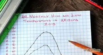
QuestionHow do I make a bar graph showing the maximum and minimum temperatures of June?Community AnswerLabel the x-axis with every day of June and the y-axis with the temperatures in degrees, then draw your bars.
Things You'll Need
- Graph paper
- A pencil
- A ruler


References
- ↑ https://www.khanacademy.org/math/cc-2nd-grade-math/x3184e0ec:data/cc-2nd-bar-graphs/v/creating-bar-charts-1
- ↑ https://www.khanacademy.org/math/ap-statistics/analyzing-categorical-ap/analyzing-one-categorical-variable/v/creating-bar-charts-1
- ↑ https://www.khanacademy.org/math/ap-statistics/analyzing-categorical-ap/analyzing-one-categorical-variable/v/creating-bar-charts-1
- ↑ https://www.khanacademy.org/math/ap-statistics/analyzing-categorical-ap/analyzing-one-categorical-variable/v/creating-bar-charts-1
- ↑ https://www2.nau.edu/lrm22/lessons/graph_tips/graph_tips.html
- ↑ https://www.mathsisfun.com/data/bar-graphs.html
- ↑ https://www.itl.nist.gov/div898/handbook/prc/section1/prc16.htm
- ↑ https://www.khanacademy.org/math/cc-sixth-grade-math/cc-6th-data-statistics/cc-6-shape-of-data/v/examples-analyzing-clusters-gaps-peaks-and-outliers-for-distributions
- ↑ https://www.khanacademy.org/math/cc-sixth-grade-math/cc-6th-data-statistics/cc-6-shape-of-data/v/examples-analyzing-clusters-gaps-peaks-and-outliers-for-distributions
About This Article
Before you can make a bar graph, you'll need to collect data that shows a comparison across multiple categories. Then, draw an x-axis and a y-axis in a large L-shape, which you will need to label according to the categories you are comparing. For example, your y-axis might measure inches of rainfall, while your x-axis separates the data according to the corresponding month. Next, use your data to draw bars onto your graph by extending the base on the x-axis to the height that matches the value of that bar on the y-axis. From here, you'll be able to see any outliers or gaps in the data that could affect how you analyze the results and form conclusions. For more tips, like how to interpret a bar graph, keep reading!