This article was co-authored by Ryan Conway. Ryan Conway is a Marketing Expert and the Founder of Digital Tradesman, a digital marketing agency that helps builders, contractors, and tradesmen grow their business online. With over a decade of experience, he specializes in marketing, web design, and search engine optimization. Ryan holds a BS in Business Administration and Entrepreneurial Studies from Hartford University. He also studied Graphic and Web Design at the Boston University Center for Digital Imaging Arts. Ryan participated in Seth Godin’s altMBA in the winter of 2016.
This article has been viewed 25,799 times.
If you want to design and create a website, you'll find it much easier if you spend some time planning it out. The planning phase allows the developer and the client to work together until they find a format and layout that matches their needs. The planning process influences the style choices of the site and is arguably the most important aspect of web design, especially for businesses.
Steps
Creating the Underlying Structure
-
1Determine the site's functionality. If you're making the site for yourself, you probably already know the answer to this. If you're making the site for another person, company, or organization, you'll need to find out what they expect from the site and its functionality.[1] Everything you decide here will have an impact on the final website.
- Does it need a storefront? Do you need user comments? Will users need to create accounts? Is it article-oriented? Image-oriented? All of these questions and more will help inform the design and structure of the site.
- This can be a drawn-out process, especially for larger companies with lots of people involved in the project.
-
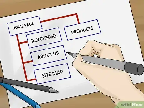
2Create a site map diagram. A site map diagram is like a flow chart and shows how users move from one page to the next. You don't even need pages at this point, just a general flow of concepts. You can use a computer program to create a diagram, or sketch it out yourself on a piece of paper. Use the site map diagram to show how you envision the web page hierarchy and connectivity.[2]Advertisement
-
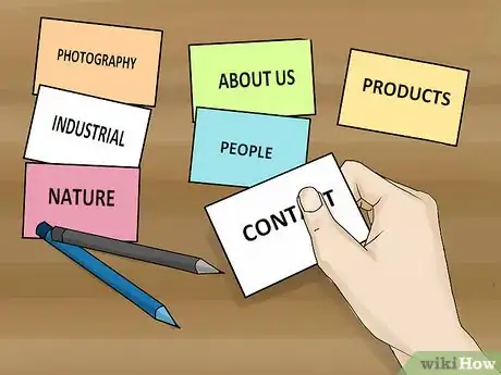
3Try some card sorting. A popular method for a group is to use a stack of cards to figure out everyone's ideal approach. Take a stack of note cards and write the basic content of a single page on each one. Have your team organize the cards in the way that they deem most useful. This is best for situations when you are collaborating with others to create a site.[3]
-
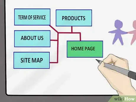
4Use paper and a bulletin board, or a whiteboard. This is the original low-budget planning method, and allows you to quickly erase or move content and reroute it. Draw the design on pieces of paper and connect them with string, or draw the outline on a whiteboard. Great for brainstorming sessions.
-
5Take a Content Inventory. This is more geared towards redesigns than new sites. Enter each of your pieces of content or existing pages into a spreadsheet. Make notes as to the purpose of each one and use this list to determine what goes and what stays. This will help cut the fat and simplify the redesign process.
Making an HTML Wireframe
-
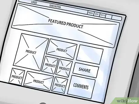
1Make a wireframe to help solidify the hierarchy. An HTML wireframe is a skeleton of your future site, using only the most basic tags and blocks to represent content. It answers the question, "What goes on the screen and where?" Formatting and style are completely ignored in a wireframe.
- The wireframe allows you to see content structure and flow before committing to style choices.
- HTML wireframes aren't static like PDFs or images, and allow you to quickly move content blocks around to create a new structure.
- A wireframe is interactive, which is beneficial to both the developer and the client. Since the wireframe is written in simple HTML, you can still navigate through it and get a feel for how moving between the pages works. This is something that can't be expressed through a PDF concept.
-
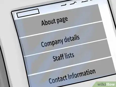
2Try the Gray Box method. Block out the content of your page in gray boxes, with the most important content at the top. The blocks are arranged in a single column, with the most important piece of content on the page at the top. For example, if the page is the company's About page, the company details might go on the top, followed by a staff list, followed by contact information, etc.[4]
- This doesn't include the header and footer. The gray boxes are simply a visual representation of the content that will be found on the page.
-
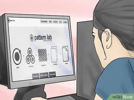
3Try a wire framing program. There are several programs that can help you with the wireframing process. The amount of coding knowledge required varies from program to program. Some of the more popular programs include:
- Pattern Lab. This site specializes in "atomic design," where each piece of content is thought of as a "molecule" that makes up the larger page.
- Jumpcharts. This is a website planning and wire-framing service. It requires paid subscription but allows you to quickly build wireframes without worrying too much about coding.
- Wirefy. Wirefy is another "atomic design" system. The tools are available for free fro the developers.
-
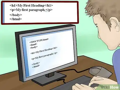
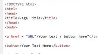
4Use simple HTML markup. A good wireframe can easily be converted into the actual site later. Don't worry at all about style during the wireframing process. Instead, use markup that can be easily understood and swapped around with little effort.[5]
- Less is more with a wireframe. The goal is to simply build the structure. Visuals can be adjusted later with CSS and advanced markup.
-
5Make a wireframe for every page on your site. It may be tempting to make a single wireframe and say "Cool, I can apply that to every page and I'm good." In reality, this will lead to a generic and boring site. Take the time to wireframe each page, and you'll soon find that every page has its own organizational needs.
Creating Content
-
1Have some content ready before you start building the website. It will be much easier to see how you website style looks if you have your actual content instead of placeholders. You don't need too much content, but it will look much better in mockups if you have some copy and original images.
- You don't necessarily need the body of an article, but you should at least have actual headlines.
-
2Remember that good content is more than text. The internet is much more than simple text websites. In order to stand out in your niche, you'll need a variety of different content types to attract and retain visitors. Some possible content to keep in mind:
- Pictures.
- Audio
- Video
- Streams (Twitter)
- Facebook integration
- RSS
- Content feeds
-
3Commission a professional photographer. If you are including photos on your site, your initial impressions will be much better with professional photography. A single good photo is worth more than twenty bad ones.
- Look for recent art photography grads for cheaper solutions than long-time professionals.
-
4Write quality articles. The written content on your page will determine the vast amount of your web traffic. While you don't need to worry too much about content creation at this point of the design process, it doesn't hurt to start thinking about it, since you'll need content on a regular basis once the site goes live.
- Beyond article content, there are written items that you will most likely during the website construction process. This could include contact information, company names, or anything else that will be used in multiple places on the site.
Turning the Concept Into a Site
-
1Style global elements. These are the things that are seen on every page on your site, such as the header, footer, and navigation menu. Create a very basic style so you can see how all of your pages will look with them in place. This will be very useful as you move into the layout process.
- Don't worry too much about the details, but do try to get it somewhat close to how the headers will eventually look.
-
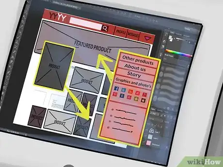
2Create a basic layout. Start moving the clocks of your wireframe out of the single column and into their general locations on the page. For example, you might move the navigation block to the left side of the page, and a list of headline to the right.
- Keep experimenting with the layouts for a few pages before moving on. Let others test them to see if they feel organic.
-
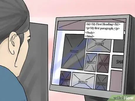
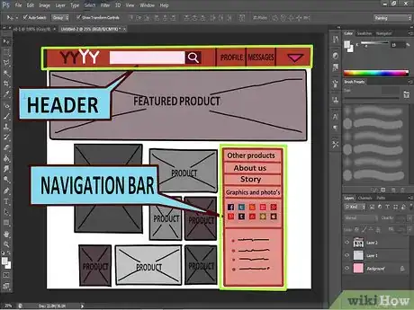
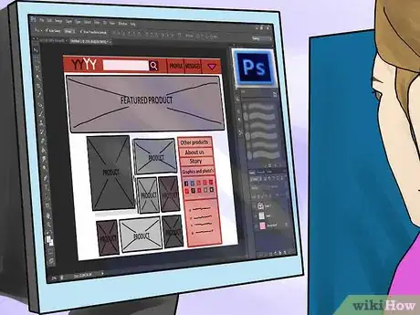
3Create a mockup. Use a program like Photoshop to create a mockup of a few pages of your site. Use the layout you've settled on as a guide. You can work much quicker in an image editing program and get everything just how you want it. This will allow you to use these images as references when it comes time to actually code.
- Include actual content in the mockup to ensure that everything looks good together.
-
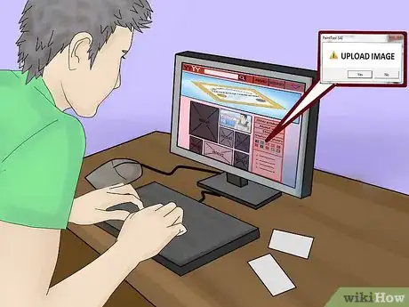
4Replace your blocks with content. Start adding your content and elements to the page. Don't worry about style yet, just get everything in the correct location. This will help you tell if your style changes are going to work.
-
5Create a style guide. This is essential for maintaining a cohesive style, especially for larger sites. If the site is for a business that already has visual branding, this should be incorporated into the site design. Things to potentially consider in a style guide:
- Navigation
- Headers (<h1>, <h2>, etc.)
- Paragraphs
- Italics
- Bolding
- Links (active, inactive, hovering)
- Image use
- Icons
- Buttons
- Lists
-
6Apply your style. Once you've decided on a style and design for the site, it's time to start implementing it. CSS is one of the easiest ways to implement style across a page or the entire site. See this guide for more details on using CSS.
Expert Q&A
-
QuestionHow can you make a website effective?
 Ryan ConwayRyan Conway is a Marketing Expert and the Founder of Digital Tradesman, a digital marketing agency that helps builders, contractors, and tradesmen grow their business online. With over a decade of experience, he specializes in marketing, web design, and search engine optimization. Ryan holds a BS in Business Administration and Entrepreneurial Studies from Hartford University. He also studied Graphic and Web Design at the Boston University Center for Digital Imaging Arts. Ryan participated in Seth Godin’s altMBA in the winter of 2016.
Marketing Expert Map out what's most important on your website. What are your calls to action? When they view your website, customers should clearly understand what you want them to do, whether that's scheduling an estimate or subscribing to an email list.
 -
QuestionHow can I make my website engaging?
 Ryan ConwayRyan Conway is a Marketing Expert and the Founder of Digital Tradesman, a digital marketing agency that helps builders, contractors, and tradesmen grow their business online. With over a decade of experience, he specializes in marketing, web design, and search engine optimization. Ryan holds a BS in Business Administration and Entrepreneurial Studies from Hartford University. He also studied Graphic and Web Design at the Boston University Center for Digital Imaging Arts. Ryan participated in Seth Godin’s altMBA in the winter of 2016.
Marketing Expert Think about who your audience is and what's most important to them. If you don't know who's viewing your website, you won't be able to create effective content.
 -
QuestionWhat is a sitemap for a website?
 Ryan ConwayRyan Conway is a Marketing Expert and the Founder of Digital Tradesman, a digital marketing agency that helps builders, contractors, and tradesmen grow their business online. With over a decade of experience, he specializes in marketing, web design, and search engine optimization. Ryan holds a BS in Business Administration and Entrepreneurial Studies from Hartford University. He also studied Graphic and Web Design at the Boston University Center for Digital Imaging Arts. Ryan participated in Seth Godin’s altMBA in the winter of 2016.
Marketing Expert A sitemap is a page that lists all the other pages on your website. It helps search engines find and list your site and makes it easier for users to navigate.
References
- ↑ Ryan Conway. Marketing Expert. Expert Interview. 17 March 2021.
- ↑ Ryan Conway. Marketing Expert. Expert Interview. 17 March 2021.
- ↑ http://www.smashingmagazine.com/2010/03/17/starting-out-organized-website-content-planning-the-right-way/
- ↑ http://v3.jasonsantamaria.com/archive/2004/05/24/grey_box_method.php
- ↑ http://alistapart.com/column/start-coding-with-wireframes


