This article was co-authored by wikiHow staff writer, Travis Boylls. Travis Boylls is a Technology Writer and Editor for wikiHow. Travis has experience writing technology-related articles, providing software customer service, and in graphic design. He specializes in Windows, macOS, Android, iOS, and Linux platforms. He studied graphic design at Pikes Peak Community College.
There are 10 references cited in this article, which can be found at the bottom of the page.
This article has been viewed 3,059 times.
Learn more...
Want to create a great logo for digital images, video, or print media? Adobe Illustrator is a great tool for the job because it uses vector graphics, which ensures that your logo will look crisp and clean no matter the size. A logo designed in Illustrator can be easily imported into other Adobe programs, like Photoshop, InDesign, and Premiere Pro. Illustrator also uses the Pantone color library, which means a printshop can print the exact color you want. This wikiHow article teaches you how to make a logo with text in Adobe Illustrator.
Steps
Preparing to Make a Logo
-
1Understand the purpose of a logo. A logo is a symbolic image that represents a company, organization, brand, service, or product. It's like a brand's signature. Ideally, a brand will use a logo as its public-facing image for years to come. You want to take the time to make sure the logo is done right and really represents the brand. They will put it on everything. There are a few things a logo needs accomplish. They are as follows:[1]
- A logo must convey a brand's image, message, or process at a glance. It can do so using short text, shapes, symbols, colors, and basic images.
- A logo must be versatile. Logos are used in all manner of media. This includes commercials, print ads, pamphlets, websites, web banner ads, social media profiles, products, packages, T-shirts, business cards, stationery, and more. A logo needs to be usable and recognizable on all these different platforms.
- A logo should be unique and recognizable. It should stand out from the competitor's logos.
- A logo should be memorable. Think about McDonald's, Nike, Coca-Cola, etc. All of these brands have logos that are memorable and instantly recognizable. Ideally, you want your logo to do the same thing.
-
2Research the brand of the logo you are designing. Before you begin designing a logo, take the time to study the brand. Talk to the marketing team or owners. Don't just pay attention to what they say, pay attention to HOW they say it. Get a feel for the excitement they feel towards the brand. If you are the owner, really think about what the brand means to you and what you want the logo to convey to the public. Here's a few questions to ask/research:
- What does the company/brand name mean? Why was it chosen? Where does it come from?
- What is the primary purpose/mission of the brand?
- What is the process the brand uses?
- What do you want people to think and feel when they think of your brand?
- What types of images do you think to represent the brand?
- What colors represent the brand?
- What are the brand's competitors?
- What do the competitor's logos look like? What did they do right? What did they do wrong?
- What makes the brand different from its competitors?
Advertisement -
3Consider what shapes and images represent the brand. You don't want to make a logo too complicated, but it's a good idea to think about what kind of images and symbols represent a brand. Think about how you might be able to incorporate these images and symbols into your logo design.
- Avoid using photographs or detailed images in your logo design. Complex images can be much harder to reproduce and may limit the logo's versatility.
-
4Consider what colors represent the brand. It's no secret that different colors can evoke different emotions. What kinds of colors do you think represent the brand the most? Much has been written on the topic of color psychology. Do some of your own research into this and see how other brands use color in their logos. The following is just a general overview of what different colors can represent: [2]
- Red: Boldness, excitement, passion, urgency, danger, stimulates appetite.
- Green: Nature, tranquility, harmony, health, relaxation.
- Blue: Masculine, peace, tranquility, security, reliability, and productivity, suppresses appetite.
- Purple: Royalty, respect, wisdom, creativity, and problem-solving.
- Yellow & Orange: Optimism, warmth, adventure, caution, youth, impulsiveness.
- Pink: Feminine, gentile, creativity, energy, friendly.
- Black: Formal, elegant, power, authority, stability, darkness, mystery.
- White: Purity, cleanliness, safety, neutrality.
- Grey: Practicality, old age, solidarity.
-
5Consider the orientation of the logo. The orientation of a logo is how much vertical and horizontal space the logo uses. While plenty of good logos are horizontally aligned, the most versatile logos tend to fit into a square-shaped area. This doesn't mean that they are square-shaped, it just means that they use about the same amount of vertical and horizontal space.
- Let's look at one example. The Amazon logo uses a lot of horizontal space. That may look fine on the side of a package, but if you tried to use it as a Facebook profile image, it would be very small and hard to see. Whereas, the Apple logo uses about the same amount of vertical and horizontal space. It looks good on the back of an iPhone and would easily be recognizable if used as a social media profile image.
-
6Consider what fonts to use. There are thousands of fonts available to use. However, they can be placed into a few categories. They are as follows:[3]
- Serifs: Serifs are the small lines you see at the bottom or top of a letterform. Serifs can be bracketed or they can be completely flat. Lots of fonts have serifs and some do not.
- Old Style fonts: Old style fonts are serif fonts. They were widely used throughout the 1500s and 1600s. Old style fonts have much more formal, professional, and conservative look to them. They are also easier to read in print format. They are characterized by their bracketed serifs. They have a diagonal stress to the thin part of the letterform. Old style fonts include Garamond, Times New Roman, and Goudy.
- Transistional fonts: Transistional fonts were widely used in the 1700s. Like old-style fonts, they have bracketed serifs. Unlike old-style fonts, they have a vertical stress to the thin parts of the letterform. There is also a much greater contrast between the thin and thick parts of the letterform. Transitional fonts include Baskerville, Bookman, and Centura.
- Modern Fonts: Modern fonts emerged in the 1800s. They have very thin serifs with no brackets. They also have an extreme contrast between the thin and thick parts of the letterform. These fonts tend to be more decorative with a vintage feel to them. Modern font examples include Bedoni, Fenice, and Didot.
- Slab Serif: Slab Serif fonts emerged around the turn of the 1900s. They tend to be a little thicker with the same line thickness throughout the entire letter form. They have flat serifs that are usually the same thickness as the letterform. Slab serif fonts tend to be less decorative than modern fonts, but still have a vintage feel to them. Slab serif fonts include Egyptian Slate, Rockwell, and Clarendon.
- San-serif: San-serif fonts emerged in the 1900s and are still widely used today. They are characterized by not having any serif at all. They usually have the same line thickness throughout the entire letter form. These fonts convey boldness and practicality. They are also much easier to read on computer and smartphone screens. San-serif fonts include Helvetica, Arial, Impact, and Bell Centennial.
- Script fonts: Script fonts try to mimic human handwriting. They often have a cursive style with the letters being connected to one another. These fonts tend to be more decorative and convey elegance and creativity. They can also be harder to read. Script fonts include Brush Script, Blackadder, Comic Sans, Mistral, Papyrus, and Lucida Handwriting.
- Blackletter fonts: Blackletter fonts have been in use since at least 1100s. They are very thick and highly decorative. They often have a gothic or medieval look to them. Blackletter fonts include Cambridge, Monmouth, and Engravers Old English.
-
7Sketch lots of rough drafts. Before you open up Illustrator and get to work designing a logo, you may want to draw a rough draft on paper. Not just one, lots of them. Don't go with the first idea that pops in your head, try out different ideas. Try different variations on a design. Once you have enough designs narrow it down to your 10 favorites. Ask for feedback on which ones the client prefers. Once you've settled on a design idea, you can start designing in Illustrator.
Making a Logo in Illustrator
-
1Open a new document in Illustrator. Illustrator has a yellow square icon with "Ai" in the middle. Click the Illustrator icon on your Windows Start menu on PC to open Illustrator. On Mac, click the Illustrator icon in the Dock or Applications folder to open Illustrator. Then use the following steps to create a new document:[4]
- Click Create new on the title screen. Alternatively, you can click File followed by new to create a new document at any time in Illustrator.
- Click the Print tab at the top. If the logo will primarily be used for online services, you can click Web or Mobile instead.
- Enter a name for the document at the top of the panel to the right.
- Enter the height and width for the document. It doesn't really matter what size the logo is, but remember that logos work best when they fit into a square-shaped area.
- Click Create.
-
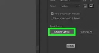
2Create three artboards. One will be used to create a line-art logo, the second will be used to create a spot-color logo, and the third will be used to create a full-color logo. You already have one artboard when you create a new document. To add more artboards, click the Artboard tab in the panel to the right. It has an icon that resembles two sheets of paper. Then click the icon that resembles a sheet of paper at the bottom of the artboard menu twice.
- If you don't see the Artboards icon in the panel to the right, click Window in the menu bar and then click Artboards.
-
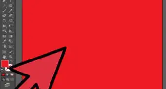
3Select black as your fill color. The first version of the logo you will create is a line-art version of the logo. This version will only use black ink (no greyscale). This ensures the logo works in its most basic form. Color printers may not always be available. Maybe you'll want to have the logo engraved? A line-art logo ensures that you can do this. To select black, click the colored (or white) square at the bottom of the toolbar on the left. Then click the black swatch in the color picker menu.
- If your logo has a shape with a line around it, you can use the stroke color to create a line. Click the icon that resembles a colored (or black) border at the bottom of the toolbar on the left. Then click the black swatch. Click the Fill color square (the white or colored square at the bottom of the toolbar) and click the white swatch with a red line through it to turn off the color. Use the drop-down menu next to "Stroke" at the top of the screen to select how thick you want the line around the shape to be.
-
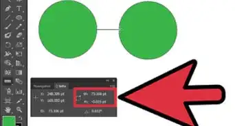
4Use the shape tools to create shapes. If your logo has shapes, you can use the shape tools to add basic shapes to your logo. Click and hold the icon that resembles a rectangle (the Rectangle tool) to display all the shape tools. Click the shape you want to use. You can select the Rectangle tool, the Rounded Rectangle tool (with rounded corners), the Ellipse tool, the Polygon tool, or the Star tool. Click and drag inside your artboard to create a shape.[5]
- To keep the size of the shape consistent (i.e. a perfect square or circle), hold Shift while you click and drag.
- To open the menu for the shape, select a shape tool and then click once in your artboard. This opens the shape menu. Different shapes have different menu options. The Polygon tool allows you to change the number of sides in a polygon. You can change the number of points the Star tool uses, or change the size of rounded corners in the Rounded Rectangle tool.
-
5Use the Pathfinder to create more complex shapes. The Pathfinder allows you to combine shapes and cut existing shapes. To use the pathfinder, create two overlapping shapes. Press V or click the selection tool (it's the icon that resembles a black mouse cursor) and select both shapes (hold Shift and click both shapes). Then click Window followed by Pathfinder (or click the icon with two overlapping squares in the panel to the right) to open the pathfinder. The Pathfinder options are as follows:
- Click the icon that resembles two squares joined together to combine the two selected shapes.
- Click the icon that resembles a dark square cutting into a light square to subtract from the bottom shape using the shape on top.
- Click the icon that resembles two dark squares overlapping with a light area in the middle to remove all except the overlapping area of the two shapes.
- Click the icon that resembles two light squares overlapping with a dark area in the middle to remove the overlapping area of the two shapes.
-
6Use the Pen tool to create custom shapes and lines. The Pen tool has an icon that resembles a fountain pen tip. Click the Pen tool in the toolbar to the left to select the Pen tool. Then use the following steps to create custom lines and shapes.
- Click where you want a line or shape to start.
- Click and hold where you want the line to stop.
- Drag the mouse to adjust the curve of the line.
- Click the point where a line ends to change the direction of a line in a shape.
- Click another point to continue the line using the same curve as the previous line.
- Click the starting point of a shape to complete the shape.
-
7Use the Type tool to add text to a logo. Click the icon that resembles a capital "T" in the toolbar to the left to select the Type tool. Click and hold the text tool icon to see a list of all the different text tools you can select. The different type tools are as follows:[6]
- Type tool: This is the standard Type tool. To use this tool, select it and click where you want to add text and then start typing.
- Area Type tool: The Area Type tool can be used to fill a shape with text. To use the Area Type tool, first, you need to create a shape that you want to fill with text. Then select the Area Type tool. Click the edge around the shape you want to fill with text and start typing.
- Type on a Path tool: The Type on a Path tool allows you to add text on a line or around the edge of a shape. This is a good way to create text that curves. To use the Type on a Path tool, you first need to have a shape or a line that you want to add text to. Select the Type on a Path tool and then click the line or edge of a shape you want to add text to. Then start typing.
- Vertical Type tool: The Vertical Type tool is similar to the regular type tool, only it types vertically from top to bottom instead of from left to right. To use the Vertical Type tool, select it and then click where you want to add text. Then start typing to add vertical text.
- Vertical Area Type tool: The Vertical Area tool works the same as the Area Type tool except it adds text vertically from top to bottom instead of from left to right.
- Vertical Type on a Path tool: The Vertical Type on a Path tool works the same as the regular type on a path tool except it adds vertical text from top to bottom instead of from left to right.
-
8Use the menu bar at the top to adjust the text. When you are done typing, click the Selection tool in the menu bar to the left. Then click the text to select it and highlight the text you want to adjust. Use the following steps to adjust the text:
- Use the drop-down menu next to "Character" to select the font you want to use.
- Use the second drop-down menu next to "Character" to select the font style (i.e. Bold, Italic, Regular).
- Use the third drop-down menu next to "Character" to select the point size of the font. You can also enter the exact font size in the drop-down menu.
-
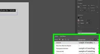
9Use the Character panel to fine-tune the text. With the text still selected, click Character in the menu bar at the top to open the "Character" panel. In addition to being able to select the font, style, and font size, the Character menu has other options you can use to fine-tune the text. They are as follows:[7]
- Leading: The leading menu is next to an icon that resembles two "As" stacked on top of each other. This adjusts the line spacing between lines of text.
- Kerning: The kerning menu is next to an icon that resembles an "A" and a "V" moving closer together. This adjusts the spacing between text characters.
- Tracking: The Tracking menu is next to an icon that resembles an "A" and a "V" moving further apart. Tracking adjust the space between characters throughout the entire word.[8]
- Horizontal Scale: The Horizontal Scale menu is next to an icon that resembles a "T" with two arrows pointing left and right. This adjusts the width of the character(s).
- Vertical Scale: The Vertical Scale menu is next to an icon that resembles a "T" with arrows pointing up and down. This adjusts the height of the character(s).
- Baseline Shift: The Baseline Shift menu is next to an icon that resembles an "A" with a smaller raised "A" next to it. This adjusts the vertical position of the characters.
- Character Rotation: The Character Rotation menu is next to an icon that resembles a "T" with a curved arrow above it. This adjusts the angle of the character(s).
- Underline: If you want to underline the text, click the icon that resembles a "T" with a line below it in the Character menu.
- Strikethrough: If you want to add a line through the text, click the icon that resembles a "T" with a line through it in the Character menu.
-
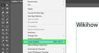
10Outline your text. The print shop or client may not have the font you decided to use for the logo. When they open the file you send them, the font will be replaced with a different font. To prevent this from happening, you will need to outline your text. This turns the text into shapes. Warning: Once you outline the text, you will not be able to edit it with the Type tool. Only do this once you are happy with the text. Use the following steps to outline your text.
- Click the Selection tool in the toolbar to the left.
- Click the text you want to outline.
- Click Type in the menu bar at the top.
- Click Create Outlines in the Type menu.
-
11Use the selection and subselection tools to adjust the size, position, and shape of the letters. While you may not be able to edit the text once it has been outlined, you can adjust the letters in other ways. Using the selection tool, double-click a letter to select it. Click and drag the letter to adjust the position. Click and drag one of the square dots around the letter to adjust the size of it. Use the following steps to adjust the shape of a letter using the subselection tool:
- Select a letter using the Selection tool.
- Click the subselection tool in the toolbar to the left. It has an icon that resembles a white mouse cursor.
- Click one of the white dots or vector points around the shape of the letter.
- Click and drag one of the blue connected dots (bezier handles) to adjust the curve of the line.
- Click and drag a vector point(s) to change the shape of a letter.
-
12Outline your strokes. If you have any shapes that have a stroke (a line around the shape). you'll need to outline the stroke in order to keep the line thickness consistent when you scale the logo to different sizes. Use the following steps to outline your strokes:
- Use the Selection tool to select a shape that has a stroke around it.
- Click Object in the menu bar at the top.
- Click Path
- Click Outline Stroke.
-
13Copy your line-art logo and paste it into the second artboard. So far, you should only be using the color black to design your logo. Once you are happy with how your logo looks using black ink, you can start to add color. Click the Selection tool in the toolbar to the left and click and drag over your entire logo to select the whole thing. Press Ctrl + C (or Command + C on Mac) to copy your logo. Then scroll over to your second artboard and press Ctrl + V (or Command + V on Mac) to paste the logo into the second artboard.
-
14Add spot colors to your logo. Adobe Illustrator allows you to add colors from different colors libraries (such as Pantone+) to a logo. This allows a print shop to print your logo using the exact ink color instead you want instead of using CYMK ink mixtures. You can even use metallic, matte, pastel, and coated ink colors (you'll need to purchase a Pantone color book to see all the different swatch colors). Since this tends to be more expensive, you should limit your spot color logo to black and two or three spot colors. Use the following steps to add spot colors to your logo:[9]
- Click the fill color box at the bottom of the toolbar to the left.
- Click the shape you want to add spot color to using the Selection tool.
- Click Window followed by Swatches (or click the Swatch icon to the right) to open the Swatch menu.
- Click the icon that resembles a bookshelf in the lower-left corner of the Swatches panel to open the Swatch Libraries menu.
- Click Color Books.
- Click one of the Pantone+ color books.
- Click the color swatch you want to use. You can also use the search bar to search for the exact color number you want to use.
-
15Copy the logo into the third artboard. Once you've added spot colors to your logo, copy your logo again and paste it into your third artboard.
-
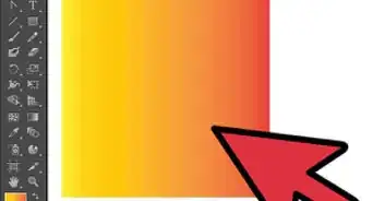
16Add color to the logo in your third artboard. This is your full-color logo. You will be using CMYK colors for this one. To add color, click the shape you want to add color to, and then add color using one of the swatches from the swatch library, or using the CMYK slider bars in the color picker. You can add as many colors to this version of the logo as you want. You can also use the Gradient tool to add gradient blends to your logo.
-
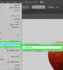
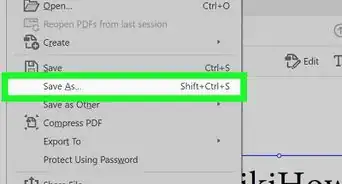
17Export your logo as an EPS file. Once you are done with your logo, you don't want to send your native Illustrator (.ai) file to the client or printshop. Use the following steps to export your logo as an EPS file:
- Click File in the menu bar at the top.
- Click Save as.
- Select Illustrator EPS next to "Save as Type."
- Click Save.
Warnings
- There are many free fonts that are available for download on the internet. Most of these fonts are free for personal use, but not free for commercial use. Always check the licensing agreement for any fonts you decide to use⧼thumbs_response⧽

References
- ↑ https://bigopposableblog.wordpress.com/2014/02/18/the-ultimate-logo-manifesto/
- ↑ https://smallbiztrends.com/2014/06/psychology-of-colors.html
- ↑ https://www.toptal.com/designers/typography/typeface-classification
- ↑ https://helpx.adobe.com/illustrator/how-to/create-new-document.html
- ↑ https://helpx.adobe.com/illustrator/how-to/shapes-basics.html
- ↑ https://helpx.adobe.com/illustrator/using/add-text-work-with-type-objects.html
- ↑ https://helpx.adobe.com/illustrator/using/line-character-spacing.html
- ↑ https://helpx.adobe.com/illustrator/using/formatting-type.html
- ↑ https://www.youtube.com/watch?v=AUDspx2oKM4
About This Article